Journey & Experience Maps
Journey Maps are meant to clarify customer understanding at various points along a continuum. The purpose of the Journey Map is to identify high and low points for the user within the experience. High points being portions of the flow that are working well and are enjoyable for the user and low points being areas where the experience is difficult or frustrating.
A Journey Map will help prioritize UX design efforts by identifying areas that have the greatest opportunity for improvement. They can be printed and placed throughout the business to evangelize the wants, needs, pain points and goals of users
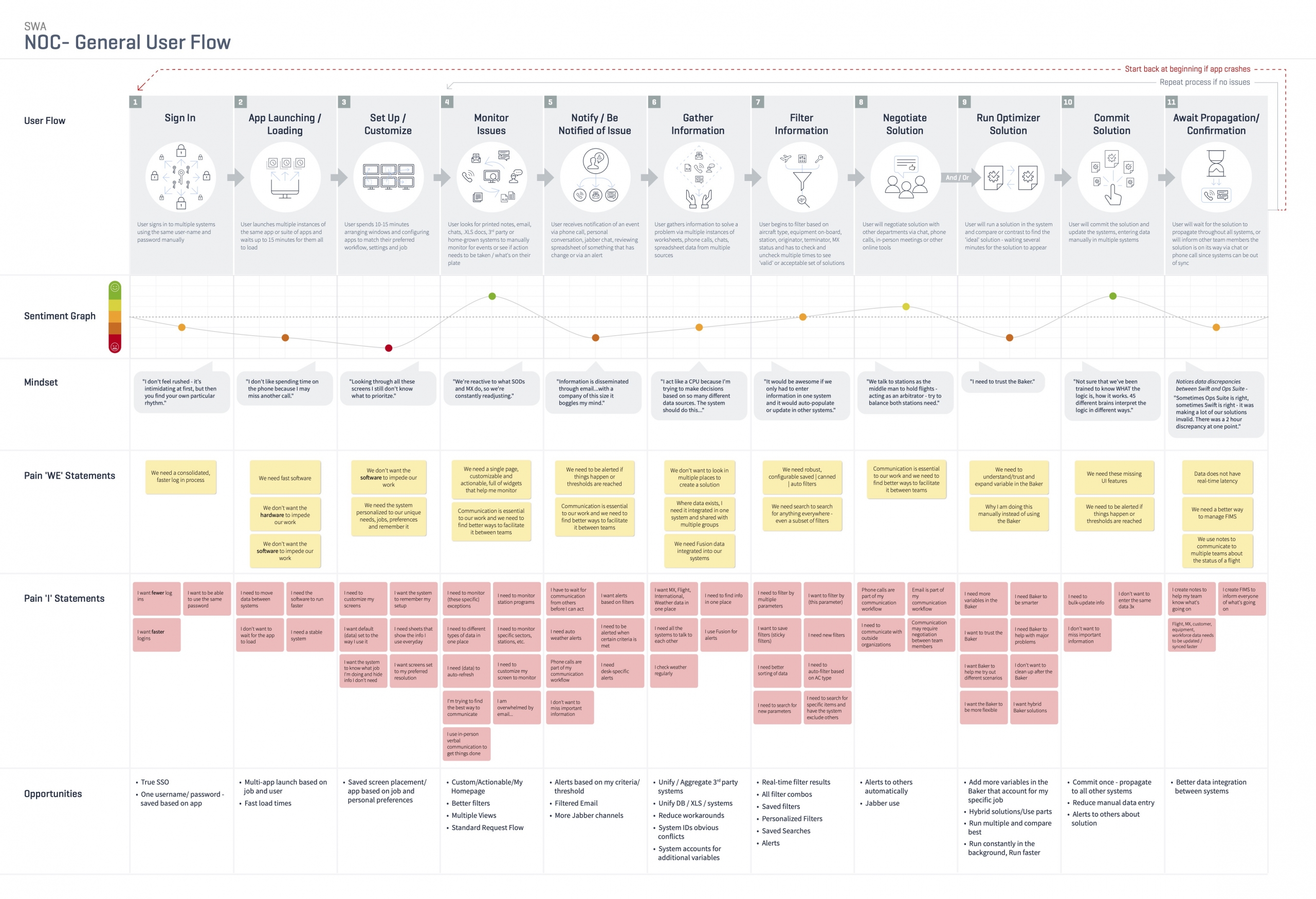
Basic Journey Map
I’ll create journey maps to match the needs of stakeholders, designers and developers. While I could just show sections of the journey along with pain points, I like to provide additional details that can show context and which themes from the affinity diagramming exercise apply to a given area.
Basic maps may include:
- High level summary of the experience in each stage of the journey
- A sentiment graph that shows positive, neutral or negative sentiments
- Quotes from contextual inquiry participants or summary sentiment statements
- Pain points – with supporting ‘We’ and ‘I’ statements from the affinity diagramming exercise
- Opportunities
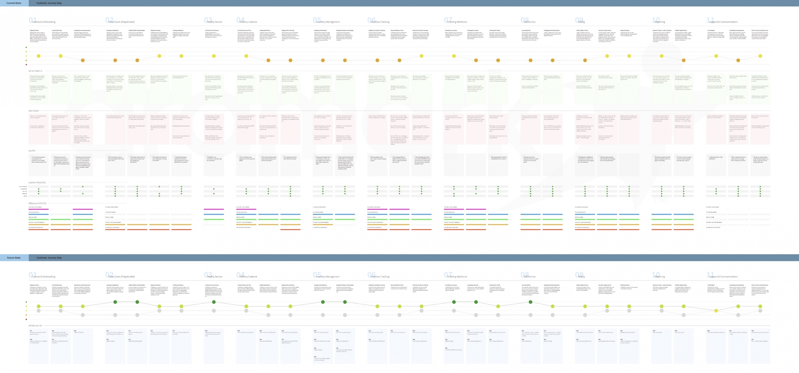
Journey Map with Current and Future States
Once you have generated and ranked opportunities – based on user impact, business impact, and tech lift – you can plot them into the existing journey and provide an idea of which areas will benefit the most.
Some clients want to use the journey map as the ultimate summary of all research conducted so far, so these journeys will also include:
- Guiding principles or design principles related to a section of the journey
- Personas affected by a given stage of the journey
- Combined current and future state sentiment graphs
- Multiple pain points
BUT, this is often only great if you have a huge monitor or you plan on printing out an 8′ x 20′ billboard. So…
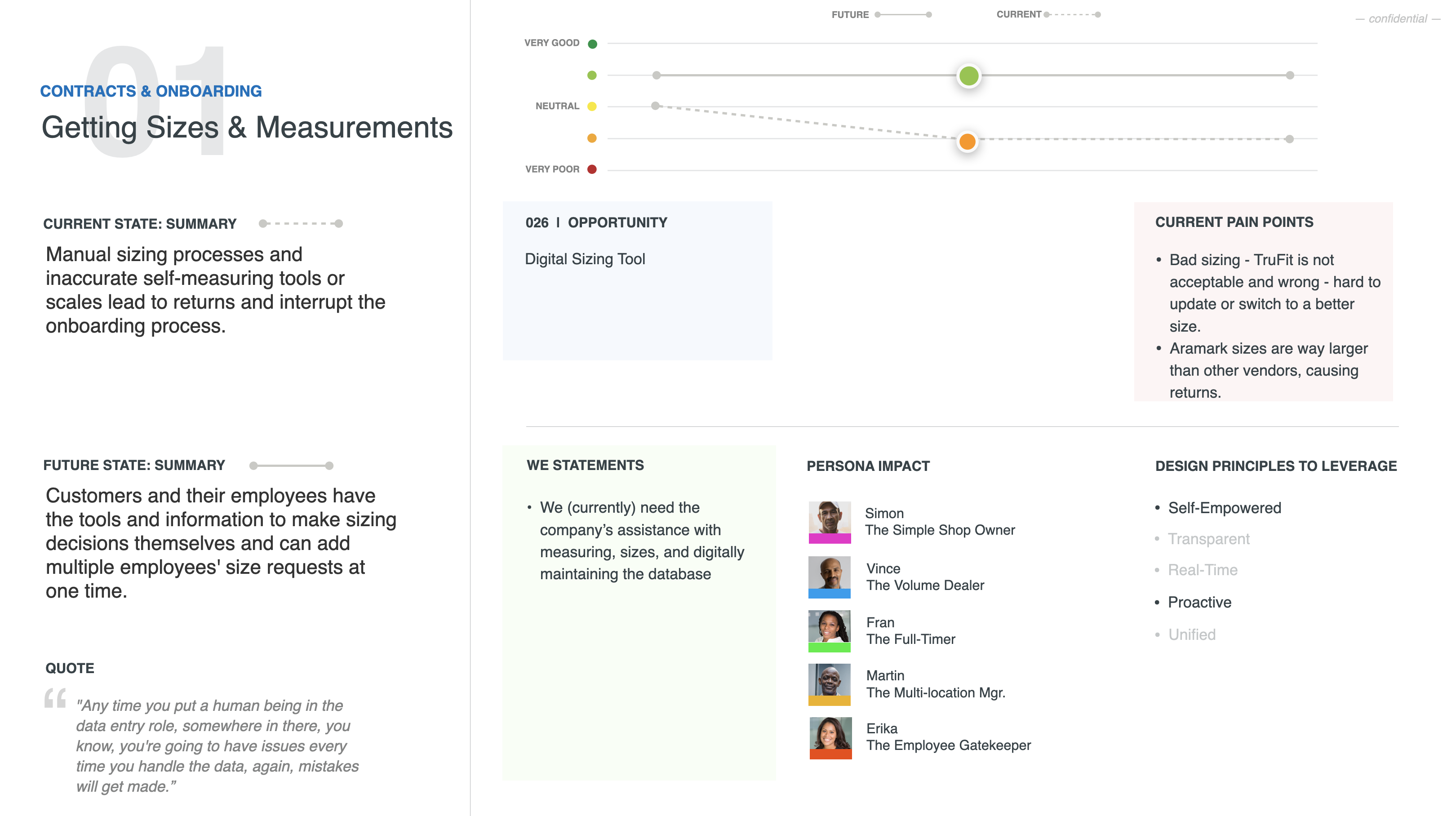
Presentation-friendly Journey Maps
Since many clients want to get a truly holistic view but don’t work in an office, I devised a presentation-friendly version of the journey map.
I take each journey’s section or sub-section and present all of the relevant data on a single slide. This will allow for the same amount of information, but viewers can select a section to get it in a digestible fashion.


